Pages

Friday 23 December 2011

Critical Appraisal: The Body (300 words)

The concept behind my portrait was to photograph a colourful personality and style. Shooting black and white allowed me to get across her own perception of herself and not mine as much as possible. My intention was for the viewer to really see her, not just how she looks. As well as this, I had almost no input in my models choice of styling or her expression; I simply posed her in conjunction with my reference.

I drew my inspiration mainly from Paolo Roversi - the posture and lighting choice from this image of the actress Tilda Swinton. 

I admired the gradient background and highlights. Having decided this was what I’d work with; I looked into the lighting set up. I also appreciated Rembrandt lighting and managed to incorporate this too into my photograph. The most important factor I have learnt from my reference has to be how to achieve certain lighting and how it can transform the mood of a portrait. For example, the highlight and triangle of lighting I have achieved on my model’s face comes across to me as particularly expressive.

I tried to prepare as much as possible before the shoot date. I found my visual reference early on and I did a lighting test before the real shoot, which allowed me to view changes that needed to be made before my model arrived. I believe I should reflect upon my studio set up which quite often becomes more complicated than I imagine it and I should always cater to that possibility. Capturing my models best side, best feature and the most natural and comfortable pose from my contact sheet overcame issues relating to the Body. The most significant challenge was achieving the right effect with my lighting choice and I am pleased with my outcome. 


My Portrait: (soft scan)


Saturday 10 December 2011

Urban Environment Project Update

Having failed to find good locations to shoot abandoned buildings I have changed my idea completely. If I had allowed myself more time I could have explored more and maybe gone and shot in a few places more than once between processing to make sure I got the shots I needed. I would have liked to do this because I liked my original idea and I feel it is possibly stronger than my current one.

I have decided to document the process of development and show how humanity rebuilds, improves and changes their urban space. Rather than just photographing a building that is decaying and dilapidated (like I would have before) or just photographing perfect architecture that either needs no improvement or has been improved; I will photograph the process which could be perceived as the ugly leading to the beauty: a before construction shot; a during construction shot; and an after construction shot.

At first my approach to this was going to be drawing inspiration from Bernd and Hilla Becher. I wanted to use a large format and correct the buildings from a straight on view and shoot in black and white. Then I decided against this angle when I found my first subject and wanted to take my photograph from a more interesting place with the contrast of the crossing lines and angles against the sky. I still shot at a larger depth of field to retain more detail.

Thursday 1 December 2011

The Contemporary Urban Environment

Deconstructing Environmental Photographers

"For many contemporary photographers the city remains an enigma: a spectacle that cannot be resolved. The experience of the contemporary urban fabric is endlessly complex and ambivalent." For this reason, it is possible for photographers of the urban environment to take so many different approaches in portraying it the way they do.

Rut Blees Luxemburg
Luxemburg works at night; shooting her images using long exposures to capture the street lights and other lights on in buildings etc. This technique leads to the majority of her work having a warm tone. This accurately portrays night time scenes in their reality aided by the physical lack of people and figures. An opinion of Luxemburg is that she shows "humanity within empty urban spaces, areas that are rarely thought of as beautiful or warm yet hold so much human life."

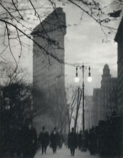
Luxembourg is a German photographer. When she visited London she noticed the very visible high-rise buildings in the city due to how little of them there were and the difference between London and Germany. The visibility from them is what interests Luxembourg. As well as her photo being of an elevated view, it has been taken at one - the 16th floor balcony of an opposite building. This was in the 90s when buildings like this were much more open and not restricted so much. She was free to wonder up and take the photograph. She has used a large depth of field to include all of the detail in the whole building and the focus is of the building while it is centred compositionally. The tonal range of the image is vast as there are dark blacks (mainly in the background where things start to disappear) and bright highlights in the lit windows of the tower block. The lighting conditions of her image is ambient with a long exposure as is common with her work. To fully capture the image, Luxemburg used a large format camera with an exposure time of 10 minutes.

Commenting on her own work, Luxemburg views her photograph as a "living sculpture" in the sense that she sees the building as having a sculptural quality to it but also the presence of people in the building during her exposure - watching tv and turning on and off lights as they entered and left rooms. Therefore Luxemburg's visual strategy to representing the city was focused on both the aesthetics and the inhabitants.

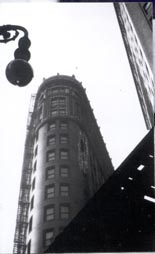
This image of Luxemburg's on the right is startlingly different to the previous. Rather than compositionally and perspectively perfecting her image, this photograph in particular looks more like a snap shot; less thought through and considered.

This image, unlike her other and unlike most of her work, includes arbitrary things like fencing just visibly along the bottom; a small brick building on the left and an element of nature creeping in at the top. Again, she has evidently utilised the ambient light, and focussed on the building where there are signs of humanity as she has admitted she likes to show in her work, and therefore the objects in the foreground are out of focus such as the leaves.

There are clear differences between this photo and her former image: it has not been taken from an elevated view but a street level view; it has not been controlled perspective wise and centred like her other work; and the tonal range is not as great because there are less dark shadows. However, Luxemburg has still managed to portray the existence of life through using a theme of lit windows in both of her images.

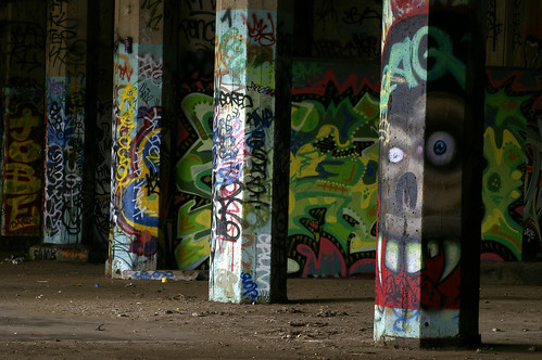
Luxemburg also photographs abandoned spaces in urban environments. The composition of this image is very interestingly divided into two halves with the ambient light causing the left side to be brighter and warmer in tone. The range is similar to the rest of her work: bright highlights and black shadows. She has also suggested a sense of humanity in the image but through a different method than her other photographs. The graffiti and markings demonstrate previous human existence which she is interested in.

Her focus is on the middle of the image; the depth of field not either of the two extremes - detail can be drawn from the whole photograph. The camera position is at a standing level. Like all of her night shots she will have used a tripod for a long exposure in the ambient light. The mood of this piece comes across as calm. Luxemburg hasn't cut any corners in representing this space as it is. A viewer can clearly see the grime on the wall and the dirty ground but they are not the focus of this space in this particular photograph. I recognise the atmosphere and the tone and the abandonment. It doesn't come across as to me as just another dirty underground passage.


Richard Wentworth
Wentworth uses the medium of photography to document his sculptures of every day life and other occurrences. Like Luxemburg, he acknowledges the presence of human life through creative and interesting devices such as this:

Wentworth has captured this makeshift action which someone has used to keep open their window. The photograph has been taken with a shallow depth of field; evident through the out of focus foreground and surrounding wall. The focus of the image is the teacup because it is the object which is serving it's purpose and holds more importance than the rest of the image. The camera position is at window sill height to relate to the teacup and document the action properly.

Wentworth's visual strategy seems to be focussing on actions of the public and how they behave towards the urban space and how they change it. Perhaps he is documenting the marks we make on the environment. Unlike Luxemburg who seems to focus on much larger spaces and themes, Wentworth's focus is much smaller: he does not photograph cities and buildings but the marks humans leave on them.

This image of Wentworth's is simply of a bottle stuck between two sticks. The composition seems inconsiderate, the colours common and the mood non existent. It seems to me that this image is very lacking in photographic skill and I cannot appreciate it's purpose as it seems there is none. The previous image was taken to capture something. There is nothing of worth in this image.

However, like his other work the depth of field is shallow and he has photographed an object put somewhere by someone. This shallow depth of field draws attention to the focus of his image: it's not a photo of a tree and bottle in the street, it is a photo of a tree and a bottle. This someone is unknown though which is a theme which seems to run through his work. It is obvious the lighting conditions are natural - a similarity between Wentworth's and Luxemburg's. Some differences between the two approaches to representing urban space is the camera angles in some cases and the tonal range. Wentworth is looking down at his subject and his tonal range is not as vast in any of his work as Luxemburg's is.

In this photograph of Wentworth's he has captured a concrete imprint of a footprint which is filled with water. It is a close up which makes the depth of field unclear. Unlike any of the previous photos I have explored the camera angle of this image is a birds eye view looking down on the focus of the image. The lighting is clearly ambient and the tonal range is barely there.

Like the rest of his photographs this seems like a snapshot which suits his approach to presenting the urban space by documenting humanities effect and presence. In process and technique his images are very different to Luxemburg who is a lot more considerate.


Vera Lutter

"Instability, uncertainty, suspense, and monumentality are entities that I consider and think about; they inform my work."

Vera Lutter is famous for her black and white photographs of architecture and cities created by using the camera obscura technique. She uses this because she views her camera as an architectural device and enjoys the relativity of this to her work of architecture. Her visual approach to portraying the urban space is intended to suggest the unfamiliarity of it - she changes the image and makes it look unfamiliar. The camera obscura allows light to pass through an aperture in a dark room and the image is projected, inverted, onto photographic paper which Lutter hangs on the wall to create paper negatives as an end result. At a glance her work looks like black and white night time shots but on closer inspection it becomes obvious they are not.

This image of Lutter's has been taken from an elevated view like Luxemburg's image of a London tower block. This means more is captured in the image. She also uses a large depth of field to ensure maximum detail in the cityscape and emphasise the geometric scale. There is a great tonal range in this image of the negative as there are very dark blacks and very bright whites. The focus seems to be directed on the closest building on the right which stands out among the other.

It is very repetitive and geometric in it's lines and shapes: the straight structures of the buildings, the long straight roads, the same sized windows patterned over the buildings. Lutter was commissioned by The Museum of Contemporary Photography to photograph Chicago and this geometric approach was the one she chose to represent the city. This is evident in other images of hers but this aspect of her photographs relates to Luxemburg's technique.


Lutter's image of Campo Santa Sofia in Venice is of classic Venetian buildings disappearing into the distance, two neat rows of gondolas and a tall building with windows and balconies.

The depth of field Lutter has chosen to use in her photograph is not particularly shallow, however; the soft reflections of the boats due to the long exposure make it look like a shallow depth of field at first glance. Despite the tonal range including dark blacks and bright highlights, the image is quite contrasted causing the involvement of less grey mid tones and therefore lowering the tonal range. This is a difference to her previous image which is a lot flatter.

This image, like the previous, is very geometric subject wise - the architecture and transport is very repetitive. This is like the first image of Luxemburg's I explored in the sense of repetition involved in architecture. It has been taken from an elevated view; again as seen in all the artists works, enabling more of the urban landscape to be included in the frame and different levels to be included like a view of each balcony level which would not be visible from a street level view.

This negative of Lutter's is a very different scene to the majority of her work which are of architectural structures and cities. While this image includes a very different subject, it seems a different approach has also been taken to photographing it. The angle it has been taken at is a very low ground level unlike her other work. The view is pointing slightly up towards the Pyramid to include the whole monument in the frame. The level is slightly at an angle which is also different to the rest of her work but relates to Wentworth's more inconsiderate compositions. The tonal range is similar to her image of venice: there is not a vast mid range but a big contrast.

A clear similarity between Luxemburg and Lutter is the long exposures chosen for their work (somewhere Wentworth doesn't fall into) Luxemburg uses it for involving and working with ambient light in her photography whereas it is difficult to gather Lutter's means as she has created black and white paper negatives - a major difference between hers and Luxemburg's and Wentworth's positive colour images. Although, Lutter's long exposures are relative to her interest of the themes of the realities of time and space which she tries to convey in her work and suggests why she has made this choice. Wentworth has no need for long exposures - photographing in natural daylight and objects falling more under the still life category.

Tuesday 22 November 2011

Urban Environment: Initial ideas

I have chosen to photograph urban decay and abandoned space for the urban part of my Environment project. I want to do this because it is the opposite of what I usually like to photograph but I believe it can still look good aesthetically. At the moment I am between two ideas.
  • I want to either photograph abandoned buildings, preferably parts of the interiors, in black and white with high contrast. 
  • I want to photograph abandoned places decorated with graffiti, in colour and produce bright, vibrant images.

Before I realised what I want to photograph I searched for photos of urban environments for initial inspiration and a black and white photograph of an abandoned interior caught my eye:


If I photograph in black and white I'd like a series of images of high contrast with one or a few sources of natural lighting much like the above image with big shadows and highlights.


However, I am also very interested in the contrast between the random graffiti shapes and the geometric lines and patterns etc. of buildings such as below. I think the image is effective because the plain, repetitive structure of the columns look good together with the graffiti.


The City: The Flatiron Building

Deconstructing Environmental Photographers

Edward Steichen, 'The Flatiron, New York', 1905

Steichen's photograph of the Flatiron building is taken from a great distance. So much so that other buildings beside it are visible and the viewer can make size comparisons, understand scale and appreciate the height of the building. Also, the building is centred unlike any of the other images. This could suggest the significance of the building as it was considered an icon of modernisation back in the 1900s after its completion.

Rather than the building itself, Steichen has focussed on the trees stretching across his frame nearer his camera and a couple of passers by in the street. He is concentrating on fleeting moments rather than the constant - the building in the background of his image providing context but it's importance still relevant. The dark tones of the branches and the figures cast against the pale background of the sky and the building creates contrast as well as displaying a large tonal range in the image.

Both Steichen and Stieglitz's images of the building were taken in Madison Square Park which enabled them to show the vertical rise of the building and was a conveniently large place to set up to take the photograph. The depth of field is quite shallow in this image of Steichen's but the effect is also aided by how far away in the background the Flatiron Building is.

Alfred Stieglitz, 'The Flatiron', 1903, and
Alvin Langdon Coburn, 'The Flatiron Building, 1911

Very similar in terms of photographic components are Alfred Stieglitz's and 
Alvin Langdon Coburn's images of the Flatiron. Their images both include 
trees and branches as an element of nature and the Flatiron building from a distance as well as a low street-level view and evident figures and signs of human life. They both utilise quite a shallow depth of field to focus mainly on the natural elements in the frame.

Stieglitz's image however doesn't include any obvious figures (there is only one small figure) and it almost seems as if the tree is what is really desired in the photograph and the building just happens to be there. However, the way in which the photograph is composed in two halves is intentional. Stieglitz said the building “appeared to be moving toward [him] like the bow of a monster steamer–a picture of a new America still in the making", and he obviously wanted to capture this feeling and show it's importance in his photograph. There is a shallow depth of field in this image as the tree is in focus but little else is.


Stieglitz took his photograph in evening light after it had snowed which gives it a very picturesque look. The flat tone of the photograph is due to his influence from Japanese wood-block prints. The lighting of Steichen's image and Coburn's image seem similar, maybe taken even later because it looks like there are street lights on and the street and the tone of the figures is quite dark.

These three images have a few small differences but share more similarities in terms of aesthetics. The photographs are complimented with landscape; thy are not architectural views of the building or portrayals of the building stading alone.

Walter Gropius, Walker Evans and Berenice Abbott have also portrayed the Flatiron Building through photography but in a very different way to Steichen, Stieglitz and Coburn.


Walter Gropius, 'The Flatiron Building, New York', 1928

Before Gropius took this photograph of the building, he had just resigned from a design school he both founded and directed and had been doing so for almost a decade. He is primarily an architect and the way in which he has taken his image of the Flatiron Building clearly shows his interest in architecture. The difference of the American architecture compared to where he'd come from surprised him. The concept of his photograph is very different from that of the previous three as he is seeing the building differently; through architects eyes so to speak. He does not portray the building along with other elements like Steichen, Stieglitz and Coburn have chosen to and also unlike the previous three the depth of field is large to include as much detail of the building as possible.

Gropius has taken his photograph from a very low angle with his camera directed upwards to include the height of the building in his frame while taking it at a close distance. This technique exaggerates the height and again, as in Steichen and Coburn's images, we gather a sense of scale by comparing it to other buildings in the photograph. The Flatiron Building here appears to dwarf others in the image which suggests superiority like Steichen has made the Flatiron Building in his image come across in a similar way. The image has been taken at an interesting angle which seems to allow the viewer to appreciate the architectural side and the size and shape of the building as Gropius would have done. Rather than the focus being on anything surrounding the building or any other aspects like nature and people, the focus of the photograph is solely on the architecture which is another difference this image has to the previous three.

Walker Evans, 'Flatiron Building seen from below, New York City', 1928-1929

Walker Evans' image of the Flatiron is very different again. There are no people or trees or elements of nature framed in the photograph; neither does the image seem to show the architectural element of the building because little of it has been shown. Instead, it is framed by other things and the view of the building is front on as none of the previous have been.

It has been taken from a very low angle as Evan's includes in his title: "seen from below". It looks just like a view of the building if you were to stand in front of it on the street and look up to the top. The composition is very geometric; a very different visual strategy used to portray the building compared to the first three images especially. Two other structures meet in straight lines at different angles on the right of the building while the building itself is clearly curved, windows repeat in an ordered way and a street lamp comprised of spheres and a curl protrudes from the left of the Flatiron. The depth of field of the image seems to be small or medium since the foreground structures are in focus but the building behind starts to go out of focus.

Evans has almost made the building seems small and insignificant with his framing and how he as cropped a lot of the building with the other elements.

Berenice Abbott, 'The Flatiron Building', 1938

Like most of the previous images of the building, Abbott's shows the height and size of the building through including the top (and like Steichen's, Coburn's and Gropius'; other buildings to show the scale). Like the previous two images, this has been shot from a low view and the focus is on the building, not anything else. Similar to Gropius' portrayal of the Flatiron Building, Abbott has also used a large depth of field in her image for a great amount of detail.

Abbott's photograph is quite like Evans' in terms of scale and also Gropius' as you can see a relatively large amount of the building. But also like the previous two images, it is more about the architecture and less picturesque than the first three  of Steichen's, Stieglitz's and Coburn's. The image was taken in the day time and in natural light which could contribute to the fact that it is less picturesque and more geometric than the first three which were taken later in the day in evening light creating more of an atmosphere.

I have chosen to compare these six images in two halves because I feel the first three hold more similarities to each other and less aspects are different as is the same with the latter three which relate more to each other. I believe the fact the first three photographs of the Flatiron Building were taken much earlier in the 20th century than the last and photography is constantly changing contributes to this.


Sunday 20 November 2011

The Body Project: Initial Ideas

My model's style is very unique, colourful and outgoing. Despite my portrait being black and white I think I can convey this still through her interesting clothing and possibly props of her choice. My approach to this project is to ask her opinion concerning artistic aspects and shoot these if I agree with them.

The most effective way to take her portrait I feel would be to really showcase who she is; how she perceives herself. I want to make it real and expressive so it is captivating for an audience.

Inspiration: Paolo Roversi


This portrait utilises an unusual and flattering pose with bright lighting and little shadow. In the case of facial expression and emotion it is not easy to see this because the photograph is of the woman’s profile which I feel is a slight drawback. I want to make the most of emotion in my portrait.


I have chosen this side on view of only the face because it is an interesting angle and an interesting take on a portrait. For my model particularly with a shaved and short hairstyle and various ear piercings this will really showcase her style.


I admire the soft diffused lighting in the last portrait and the emotive pose. This seems really genuine and I’d possibly like my portrait to be the same. The painterly style ties in with the emotion, softening the whole image.


Each pose Roversi has shot his subjects in could work for my shoot – showcasing my model’s style. I’m still deciding what kind of pose to shoot.

Thursday 10 November 2011

Reflections on Interim Review

Since having my work assessed in the interim review, I have come to the decision to change a few things in my work. I appreciated the feedback because it made me realise how to improve my projects.

  • I am considering whether or not to reprint my Object image. I think the colours are appropriate for the issue I have explored but my initial desire was for it to look warm. I may reprint and decide which looks better; the warmer image or the colder image for the point I am trying to put across.
  • I have also decided to reprint two out of the three environment photographs I displayed to make the colours perfect and evoke the right feelings in people. I want to reshoot the other photograph because it didn't fit in with the series very well and was two different from the others. I want them all to relate well to each other and really work as a series.
  • The other adjustment I might make is on my pastiche. Due to low contrast in my exposure it was hard to print without either getting an image slightly flat and bright or an image too dark.

As it stands, I feel like I need to make these changes before I'll be happy to submit them again. This time when I print I will leave enough time to walk away from my images and hopefully be able to decide when I look at them the next time if any further improvements need to be made.

Wednesday 2 November 2011

Critical Appraisal: The Rural Environment (300 words)

My environment series on graveyards and cemeteries displays the juxtaposition between the beauty of them and their not so beautiful connotations. My aim is to demonstrate how beautiful these landscapes can be because my personal approach to representing the landscape is to portray it at its best as this is what I strive for in my photography: finding beauty. I want people to feel positive about my photos and understand how I perceive the environment.

During my research I looked through a lot of photographs of my chosen subject which were not befitting. It really made me realise I wanted my own to have warm lighting and colours and focus on the natural environment of these places. I wanted to create my work in a similar way to Simon Ward. The significance of his work is that he is known for creating images of beauty from something not commonly perceived as beautiful and I want to create beautiful landscapes of places often depicted not only in black and white but in an eerie and spooky manner.

I managed my studies conveniently though taking test shots on 35mm film, making contact prints of these and recomposing my favourites on medium format film then processing this for my prints. I also arrived early to print and utilised my time effectively to get them all done in a couple of days.

My final prints are warm in colour, and focus on the positivity of nature in my chosen locations; the graves even taking a step back from the focus in some cases. The challenging part of completing this project was managing time. I overcame this by being prepared with my negatives and being punctual. I wouldn’t change anything other than possibly fine tuning the colouring of my prints but I am very happy with my finished project.


My series: (inaccurate colour through scan)


Critical Appraisal: The Object (300 words)

Upon being asked to create a still-life concerning a current social issue, the concept of my photograph is a significant contributor to Global warming; the melting ice caps. Everybody seems to be aware of it and understand how it is affecting our planet. Through this I also display rising sea levels by photographing the melting ice floating on the surface; aiming to visually recreating the scene as it would be occurring.

Through my research I discovered that some people call the issue of Global Warming a theory. Others believe it is fact. One strong viewpoint is that natural climatic adjustment is causing the changes in our Earth and that this is inevitable. For this reason I wanted to portray Global Warming from a somewhat outside perspective as I was unsure of where my loyalties lay on this particular issue. I managed my studies through taking advantage of gaps in my day and spending time in the library doing my research and taking my whole idea to the tutorial to enable me to really explain my idea and receive developed feedback to help me.

The most challenging thing about creating my image was lighting it. I back lit my photograph specifically to create this glow which represents the sun and it's affect over this social issue. It plays an important role in my photograph as well as simply lighting my image. The use of a snoot on a light head being directed through full tough spung allowed me to successfully create my desired effect as well as utilising a soft box overhead to prevent reflection from the glass.

To improve I would consider incorporating more colours into my image; lack of time prevented me from doing this. However, I am happy with the almost neutral, cold feel which my image holds.


My still-life: (line only on scan)


Monday 31 October 2011

Environment Project: Shooting and Printing

Last week during my days off I took three rolls worth of photographs on my 35mm film camera. These were test shots in a sense but I planned to use these if worse came to worst and they turned out to be very helpful.


A good few of my photos were not exposed correctly on the contact sheet but I could save these when printing individually. However, I looked at the rest I could make out; looking for the best composed and the warm beautiful colours that I could make my prints from to convey the beauty of the scenes.

Then later in the week I went back to the same places, and re-composed my favourite shots out of the 35mm lot. This time I used a 6x9 medium format back on a Wista; 160 ISO medium format film and chose a shallow depth of field for a lot of my chosen shots. I felt that this would be more fitting while showing the beauty of them and create a nice look. However for some I needed to have it all sharp for the scene to be viewed as a whole and really appreciated.


I have chosen to print a series of 3 images. Frames 1, 5 and 6 are the images I have chosen to display as prints for my environment series. However, upon closer inspection I have noticed some faults with the first frame which may have occurred during processing. If I can't print this photograph I will print the second frame instead.

Overall I want my photos to look warm and make people feel good when they see them rather than negative. And rather than find them effective in a haunting way as graveyards and cemeteries are often depicted, find them effectively beautiful and inviting.

Wednesday 26 October 2011

Environment Series Research - Simon Ward

Much in the way my idea for my environment series involves portraying the beauty in something usually not associated with that quality, Simon Ward, a fine art contemporary photographer; scans objects taken from graveyards and dead animals to make "aesthetically beautiful and memorable images". I'm not sure whether I personally agree with this comment but I know some people will be able to appreciate the beauty of something in death. I hope through my photographs I can achieve the same.

He also did a project called 'The Guardians' where he collected items from children's graves and scanned them. It is said that "the objects function as an attempt to compensate for the loss by creating something tangible, a receptacle for the placing of memories".

I find Ward's work too controversial for me. I don't agree with the fact he has stolen things from graves where people have lovingly left them in memory just to create scans. I would have much preferred to look at photographs taken of these items in their original environment where no interference has occurred. I wouldn't say his images of his late pet cat are in bad taste but I don't agree with them and I don't feel anything positive while looking at them. I don't particularly think it is a respectful thing to do with a dead animal; especially domesticated.

Simon Ward deals greatly with the theme of death in his work and where the locations of my environmental images holds these connotations too, I do not want to focus on it. I want to show the aesthetic beauty within my locations through capturing them in a way that is overall positive and so that people appreciate the beauty in them rather than what they usually mean.

Tuesday 25 October 2011

Still-life Object Production Shoot and Printing

Shoot

Last week I shot my photograph for my object project. When the day was over I had mixed feelings about how it went. I managed to take and process two photographs and had help with taking two polaroids but didn't have time to process my last two negatives. I put these in my locker over the weekend so I was unaware of how they would turn out.

Two of the photos I'd taken landscape and wasn't keen on the way they looked in that orientation. The other two were portrait and in one of them my object was not straight but luckily I ended up with one I was happy with.

I had a lot of help with my shoot because I was working with ice and water in a glass vase so this immediately made it more difficult. I was also trying to work to a desired lighting effect which had to be particularly catered to. Along the way so many light packs and leads and flashes wouldn't work when I needed them which is what too up so much time.

I ended up taking my first photograph at half past 3, an hour before the processor shut. I was worried I wouldn't be finished in time and would have to do it all over again which I really didn't want to have to do.

I am not very familiar with studio lighting and maybe if I hadn't changed my idea the night before my shoot I would have had time to ask someone about how to light my object how I needed to and be prepared for the day as this is what took so long to do. Before my shoot I'd done two test shoots. One was not a complete still life and the second I just wasn't happy with in general; it didn't work.

My best photograph:

shot at f 8.5
shutter speed 500
power 6 on bron colour pack
used a snoot, soft box and full tough spung
used a horseman and 210mm lens


Printing

Today I made my final print of my object photograph. I managed to use only 4/5 sheets of my paper to do this which I was happy about. When I did my step wedge (cyan 0, magenta, 60, yellow 80) it came out very yellow but I went back in to the darkroom and printed another test strip at 22 seconds with +40 yellow and the strip looked great despite making a mistake when exposing it and exposing it for 2.2 seconds and then 22 on top of that when I got confused with the switch which changes the value of the numbers. However, the colours were all neutral as they should have been and it was in focus and exposed perfectly.

When I came to print next, I changed it so it was exposed for 22 seconds but did not alter any colour levels. The loss of 2.2 seconds made my whole image too green so I had to -5 magenta.

Not long after this I managed to print my image at f32, for 24.2 seconds, at cyan 0, magenta 75 and yellow 100. This is my final print which I am very pleased with:

Tuesday 18 October 2011

Reflection on darkroom practice - Colour Printing

Today I successfully completed my colour printing induction. I was a bit nervous and apprehensive about it beforehand because I thought it would be really difficult due to the darkness. However, when in there it's different.

As I did in the black and white printing induction I made some mistakes in this one during printing. I opened my lens to see my projection through the enlarger and to focus my negative but then when I came to do a test strip I ruined two by forgetting to close the lens down to f32 so the strips came out black. I also struggled to cut nicely sized test strips in the darkroom as a couple of times they felt big enough before I cut the paper but then turned out too thin.

After I'd got this out of the way I successfully made 5 test strips; adjusting my magenta and yellow levels along the way by using the filter kit to help me decide how and in what amount. I found this helpful to have at hand.

When I got to my 5th test strip I decided this was the one to go with but when I did a print it came out with the colour of my previous strip despite having changed nothing. This was strange, but I changed my numbers again and got my desired colour. The negative I was working with was taken with hard side lighting so it was a difficult one to work with but I got there in the end.

I ended up making 3 whole prints after my test strips because of the strange colour alteration that occurred and they all came out of the machine wonky because the slots in my easel I lined my paper up to were loose and moved around when I tried to line it up. This was annoying because there was no way I could fix it and couldn't see which position on the easel was right in the darkroom.

However, I am happy with the colour of my final print.


Details:
0    - cyan
49  - magenta
62  - yellow
f 32
8 seconds

Monday 17 October 2011

Multiple/series of Environment Photographs

Other than the pastiche which we are required to first complete for the Environment Project, we have also been asked as part of the course to take a set of (at least 3) photographs "based upon [my] personal conceptual approach to representing the landscape."

Since my personal approach to representing the landscape is to portray it at it's best, my idea is to display the juxtaposition between the beauty of graveyards and cemeteries and their not so beautiful connotations. I want to demonstrate the beautiful side to this sorrowful subject and in a way, make it a positive thing or at least allow people to perceive it in this way because this is what I strive for in my photography: finding beauty.


I thought to make this series personal I would visit cemeteries and burial sites where someone I know resides. This ties me emotionally to these places and therefore to this series. Perhaps for this reason I will be encouraged even more than usual to be conscientious. I have plans in the near future to visit some places where family and friends of family are buried.

We have been given a choice to use colour or black and white. In my opinion this topic best suits black and white and is usually depicted in these colours due to the theme of death tired to it. However, to get across what I want in my photograph and show the beauty in the landscapes, I will use colour.

I have never really focused on this topic of landscapes before but I do have a couple of cemeteries in my area. These are some photographs I have taken of them in the past:


Before visiting the places I intend to take my photographs I plan to revisit the cemeteries nearby and get a good feel for my subjects, but look at them in the right context. This way I will be more likely to achieve my aim because I'll be better prepared. I will also practice taking (and maybe editing) the photographs in colour which I am familiar already with.

Sunday 16 October 2011

Object Tutorial Outcome + Test Shot

Following my object tutorial earlier in the week, my tutor suggested my still life be an allegory of causes of Global Warming meaning the melting ice cubes would make up one part of my still life rather than be the focus of it.

My still life will represent 'Global Warming and Humanities Effect on the Earth'.


Objects
I now want to incorporate other aspects of this social issue into my still life. I've decided to use the following objects to represent these different elements:

  • melting ice cubes - melting ice caps
  • burning incense - pollution (smoke and C02)
  • a toilet roll rube - recycling (and to look like a chimney for the incense/smoke)
  • an oil can leaking - fossil fuels and oil spills
I also want to somehow represent deforestation which I believe is a large part of Global Warming so should definitely be considered in the still life.


Background, location and lighting
I have decided to shoot my objects on a blue reflective surface (to represent the sea and emphasise the objects). To do this for my test shot I used two sheets of blue textured paper, scrunched up and flattened out again to give it a more crinkled effect, laid side by side under a thin sheet of clear acetate. I have determined that to gain a clear and effective contrast with the smoke and the backdrop, the backdrop needs to be dark so I have chosen black. I used side lighting for the reflections and for the smoke. It looks powerful and enigmatic which I think fits the photograph.


The test shoot
The process of taking a test shot of my still life was frustrating. A couple of things went wrong but now I know how to do a better test shoot next time.

Improvements:
  • I'm going to use more paper and more acetate to cover a wider surface. This will allow me to be further away from my subjects to include more in my photograph while not having any original surface area exposed.
  • I will have a larger backdrop in the studio which will help with the above.
  • Having a larger surface area covered with the reflective surface will also means none of the water will be able to leak onto the paper as it did during the test shoot.
  • In my next photo I will have all the objects to finish my still life.
Another major aspect of my final image is that I need a large depth of field. Everything in my still life has an equal role. Much is the case of some of Thomas Struth's older work where everything in his images is sharp. I need to reciprocate this in my own.


Camera: Nikon D90
Lens:
Lighting:

Thursday 13 October 2011

Researching Thomas Struth

Some of Thomas Struth's photographs really appeal to me visually. Perhaps the sharp, striking black and white structures of the cityscapes and scenes seemingly devoid of life are what makes them eye catching and engage me as a viewer. It seems he photographs a few different subjects but sticks to only these - jungle-like scenes, black and white streets, and groups of people. 

My impression of Struth's city scenes majorly contradicts thoughts about his shots of people: "he captures people observing and therefore we connect with people and places he portrays". It is known that through photographs he attempts to show the relationship between people and their modern day environment. In some it seems there is no relationship.


These photos are part of his earlier work where he has drawn great influence from Bernd and Hilla Becher in the typographical sense. A difference I notice is that I see some emotion in Struth's work, even if only slight, and The Becher's weren't interested in that aspect at all.

A technical choice Struth uses for his photographs is not focussing on and drawing attention to a certain part of the photograph. This causes a large depth of field; everything is sharp and nothing is blurred.


"His work is a sensitive and ample vision of reality without artificial techniques which would divert viewers from the real meaning that the photograph has to communicate."

This analysis relates his simple way of taking photographs to how he wants people to read them simply; read what they are communicating without unnecessary distractions to "divert viewers from the real meaning". The use of the lexis "has to communicate" in particular proves the photograph is making a point. Struth wants to get this point across in his photographs easily. As the saying goes: what you see is what you get. It is a recording of reality.


My favourite photograph of the three is the first. It is the most interesting in my opinion and really attracts my attention. The contrast probably contributes to this which the last photo is somewhat lacking and it seems flatter in general in comparison. Compositionally I can really appreciate the symmetry. Although it's not perfect it seems better this way - much more natural. Complete symmetry would transform the photographs notion - it would seem less realistic and Struth is telling a story through it's theoretical simplicity. There is still a sense of real balance and the proportional lines and textures all make the photograph really nice to look at and explore. How the car draws you in, manages not to through off the balance and doesn't detract from the rest of the photograph is really effective and in my eyes, makes the image very successful. I like the sense of desertion and how the image seems devoid of life or at least like time has stopped (the stationary car waiting at the stop sign) but not in an eerie or uncomfortable way. It just seems calm.

There are some obvious similarities which each of the three photograph's of Struth's share; some of which I have mentioned already. These are:
  • the large depth of fields to cause everything to have equal rights within the images
  • the proportional lines and accurately portrayed structure of the buildings
  • the flat and uninteresting sky (similar to the Becher's work)
  • and most of all, the streets fading into the distance drawing your eyes with them - the dominating sense of perspective

Monday 10 October 2011

Developments on Object Project

My initial idea for the object part of my 'Body and Object' project is Global Warming. It is a constantly occurring social issue so I thought this would be perfect for the project and I think I can easily put my opinion across though it.

First I was trying to think of objects that could portray the simple problem of Global Warming and that people looking at my photograph would be able to draw links between. I imagined using a bicycle wheel propped up against a large bottle of water but then struggled to think of anything else significant I could use in my still life image.

I also thought about setting up my still life on and with backdrop rolls of blue and green as these are Earthly colours. However, I didn't want it to make my photograph look unprofessional; especially using two different colours. If I was to set objects up with these colours they may not be able to be portrayed as nicely with the colours as they would with black and white backdrops.

The idea I really want to work with is melting ice on a reflective surface. I think melting ice would look really interesting in a photograph, and obviously, it relates to the biggest issue of Global Warming - the melting ice caps. I don't think this is too cryptic an idea either which I'm pleased about. The reflective surface the ice would be melting on would be simply to emphasise the effect of the ice melting in the photograph but could also represent the sea in it's reflective appearance. To really reflect the sea I could use something reflective which is blue - this would make it more realistic and relative and also add some colour to the photograph.

This is the idea I really want to work on and develop further if I can. I plan to find something to base the ice on by the end of this week and also have done a test shot to see if it works as a photograph.


Reflection on Processing - B&W and colour

Before learning how to print, I was shown how to process my negatives (of which I have learnt how to do 35mm, medium format and large format now).

I was given a proper induction on the medium format which seems to be the hardest of the three. This was the first format of film I processed. I had someone in the darkroom to help me and they were definitely needed. I took the sticker off my roll of film before I entered the dark room and I was glad I did this because it wasn't an easy job. When I got into the room it was hard to place myself. I was confused where I was facing and when it came to finding the bin I struggled and then thought it was the paper I was holding while looking for it but I had the film in my hand.

I hole punched the end of the film easily enough and putting the feeder on the end was easy but it was a bit of a struggle to take the tape off the end of the roll because I was trying to be careful. Putting the film in the machine was also simple enough when I knew where it had to go and to put the rest of the roll on the velvet patch while it was waiting to be pulled in.

My negatives came out great. The exposure looked good on all of them excluding one which was quite bright and each was in focus. Despite having some trouble in the darkroom because it was my first time I think I can do it again next time with some confidence.

Since then I have developed my own rolls of 35mm film (colour) which I find a little tricky and have had help with but hope next time I can do it on my own. Most recently I have processed large format film which I find is the easiest and fastest.

Reflection on darkroom practice - B&W Printing

Last week (Thursday the 6th) I had my black and white printing induction. I found I was given all of the information sufficient for doing my first print in the talk we had. It helped slightly that I had previously seen printing done before but I was a bit apprehensive having never done it myself.

We each made a contact sheet of our negatives. Well I had mine done for me for the example but I'm confident I can do it myself next time. Then I chose the best photo from the 12 I took in the studio. All I was really looking for was good lighting and as few dust spots as I could see because the composition of all of the images was exactly the same which is something I wished I'd done differently - moved my subject around during the shoot to make it more interesting for printing and choosing negatives to print. I'd managed to take all of my photos in focus so I didn't have to worry about that aspect while choosing: only while in the darkroom.


I made some big errors during the printing which I have definitely learnt from:

  • The first thing I did was print my first print upside down because my neg was in the clamp the wrong way round so I took it out and spun it for my next print. I wasn't aware I'd done it wrong because I didn't think how you put the neg in affected the print specifically.
  • I fogged some of my paper with test strips of the same paper while it was in my box and had big black squares appear on my test prints. This taught me to be more careful with my paper and not have even one sheet out of the black packet while in the box.
  • I also exposed my paper to the focus light while trying to do my test prints. It seems an obvious thing to get wrong after being told about exposing our paper to light but it didn't register it was wrong because it looks like a different kind of light and still in the darkroom. This is definitely a mistake I won't make again and feel silly for having done.
I'm glad these things happened in a way because now I'll remember every time I come to print again and be extra careful in these areas.


At the end of it, my print of my studio shot was approved and I thought it was a brilliant first attempt at printing for me. I then successfully made another test strip and print by myself to prove I could make a print on my own.

I ended up with the following prints (excluding test strips):

  • first print: 10 second exposure on gradient 2 (upside down and slightly wonky
  • second print: 10 second exposure on gradient 2; 5 second exposure on gradient 5 on top (better; more contrast)
  • third print: 10 second exposure on gradient 2; 5 second exposure on gradient 5 on top; covered kettle with my hand during another 5 second exposure on gradient 5 on top of that. (fingers visible)
  • fourth print: 10 second exposure on gradient 2; 5 second exposure on gradient 5 on top; covered kettle with my hand during another 5 second exposure on gradient 5 on top of that. (same contrast in shadows as third print but more detail and less blacks on subject - desired effect)

I was proud of my finished print and I learned a lot from the induction having made all the mistakes which I have now got out the way. I think next time will be a more enjoyable experience because I now know what I am doing in the darkroom.


Monday 26 September 2011

My research and conclusion about Global Warming as a subject of still-life

Opinions on Global Warming
Some people call the issue of Global Warming a theory. Others believe it is fact. One strong viewpoint is that natural climatic adjustment is causing the changes in our Earth and that this is inevitable. 

“Global warming may well be the straw that breaks the camel’s back. It could turn out to be the difference between a category three hurricane and a category four. Global warming as caused by greenhouse gas emissions can lead us to a definite imbalance of nature.”

Causes of Global Warming
Global Warming is viewed as a chain of events affected by hundreds of environmental factors. Global Warming is caused mainly by Carbon Dioxide emissions. Some CO2 emissions cannot be controlled; such as the eruption of volcanoes for example, or simply the breathing of the human race. However, these kinds and mounts of emissions are not a problem for the Earth which is able to absorb them into the normal regenerative process. It is the excess emissions and the extent of them which the Earth cannot adapt to handle.

Conclusion
It is evident from various charts on the Internet that transportation and the use of electricity play the biggest roles in CO2 emissions. These aspects are easy to improve in my opinion. The way forward is for everyone to work on reducing his or her carbon footprint. This way if everyone contributes to solving the problem it can be easily resolved or at least begins to be. Maybe with my image I can give people the motivation they are lacking to make a difference by putting across my opinion reflecting upon the pressing situation of this ever-current social issue that we face.


www.globalwarming.com

Sunday 25 September 2011

Initial research and inspiration: Object and Body

To know where to start when beginning the Object and Body project, I read through the entire obect section in the brief; highlighting and underlining key points while I went along to make it easier to follow when I went back to it. One still life image which interested me instantly from the brief paper was Edward Collier's 'Still Life with a Volume of Withers' Emblemes' (1969).


I was drawn to it due to the musical instruments which I can relate to but also by the colours and style which depict (to me at least) an older time. This attracted me because I like to imagine how people lived hundreds of years ago and what it was like and this still life image - although a painting and not a photograph - portrays an idea of history. However, the subject of the still life seems to revolve around the arts and unless there is a current social issue of the same, it was not much help to me. I decided to bear this in mind but move on.

My next move was to look into the other photographs accompanying the briefing notes as they are examples of still life images and I assumed they were put there for a good reason. I thought Edward Western's sculptures were interesting in shape and idea but could not relate to my brief very well if I were to persue him as a source of inspiration. I found Laura Letinsky's work interesting as it seemed very conceptual to me - like each photograph was telling a story and you could come to your own conclusions about what that story was. But again, I found this a lost cause to draw inspiration from as her specific subjects would be difficult to relate to my project. Keith Arnatt's series of 'Pictures from a Rubbish Tip' could possibly tie in with the current social aspect of my project.

After this, I read up on some social issues that have been circulating recently which caught my attention through news websites (as I will admit I'm not very up to date on my current affairs and had to look these up). The next place I went to for inspiration was the BBC News website which I thought would potentially lead me right to where I wanted to be. After having a short look around and not finding anything I could imagine easily portraying in a still life I decided to explore my original idea of the issue of Global Warming since it is always a current social issue and a pressing one at that.

To try my luck, I did a quick search in Google for "global warming still life" but received nothing to really work on and gave up for now having a basic idea formed. I think with more exploration on this topic I could develop a stronger opinion than the one I already have and portray it powerfully while even evoking something within the viewer of my image.

Friday 26 August 2011

UCA Summer Project

Still life self-portrait


Developing my idea
Upon reading I had the task of creating a self portrait without appearing in it myself I began thinking of what kind of objects I thought related to me and my personality; objects which would represent me well. The first whole idea of an image I came up with was the one I ended up sticking with and it came to me quite quickly while I was simply considering my brief. For this reason I assumed it would be a good idea to think of other ideas for photographs I could be portrayed in through still life but as well as the fact that this was harder than I thought, I was also happy with my first idea after finalising my photograph.

My original perception of my self-portrait changed as I developed my idea further. I first imagined a single pink gerbera flower lying on dusty, cracked ground. The juxtaposition between subject and location is what made this image appeal to me and caused me to want to capture it as my self-portrait.

Then I noted ways in which my still life self-portrait represented me. While I was trying to decide which flower would best suit the image and myself, someone told me about the passion flower. I thought the meaning behind it was perfect in representing me and went ahead that day in taking the photograph of the flower in an unusual place - with some help, as it was quite a difficult task.


Taking the photograph
I asked my boyfriend to help me with my photograph because I needed 2 pairs of hands - mine to take the photograph and his to hold the flower. We found the perfect place where the ground was cracked very effectively and looked just as I had imagined. The only downside was the wind which made it difficult to take the photograph in focus. After constantly changing position and angle and becoming a little frustrated that it wasn't looking as good as I'd hoped I eventually took a few that I was happy with and headed back to have a look at them.


Editing the photograph
I used Photoshop to edit my photograph. I chose the best photograph from the ones I had taken. I judged this mainly on the focus but also on which position the flower looked best in and how well you could see the ground and the flower protruding from it.

Firstly, I optimised the contrast and exposure of the whole photograph by using curves. I created separate layers for the flower and the leaves and edited these differently so not one of the two was too saturated or too different in tone and they needed to be different fro the background which altered when I made differences to the flower itself. Then I removed distracting elements from the background, behind the flower, by clone stamping. To make the ground look more African, I used the curves again to change the contrast and exposure of the ground. I then used the colour balance to change the colour and the shade of the ground and lastly I duplicated the background layer and made this layer darker and created a gradient layer mask to cause only the foreground to be affected. This allowed the colour of the ground to fade into the paler colour of it underneath the more recent layer.


How my still life self-portrait represents me:

  • The ground represents where I am from in it's state and colour - Africa, my origin; which is significant to me and who I am. Spending my childhood with the people I did and in the place that I did has had an affect on who I am and is therefore very accurately representative of me.
  • The flower being in this location is a surprise which symbolises the surprise that people have when they find out my origin.
  • The flower being (made to look as if it is) able to grow in this unusual place represents my ability to flourish somewhere new and different to where I am from.
  • The flower is one of my favourite colours which relates to me - one of my preferences.
  • My reason for using the passion flower in my photograph to represent me is due to it's religious meaning which is relative to my life as I have been brought up in a Christian family and have been raised accordingly.
  • The flower and I share similar qualities such as femininity and fragility which is another reason why it represents me.
  • The single flower is to signify how I see myself as my own person; someone who doesn't follow the crowd and most importantly how I believe I have "found myself".
  • Lastly, my style of photography is portrayed through the subject - my work is primarily of the natural beauty of the world and I find when I am in my favourite environments for photography, my photographic eye usually only deems such things worthy of taking a photograph of. 

My original image


My finished still life self-portrait