Deconstructing Environmental Photographers
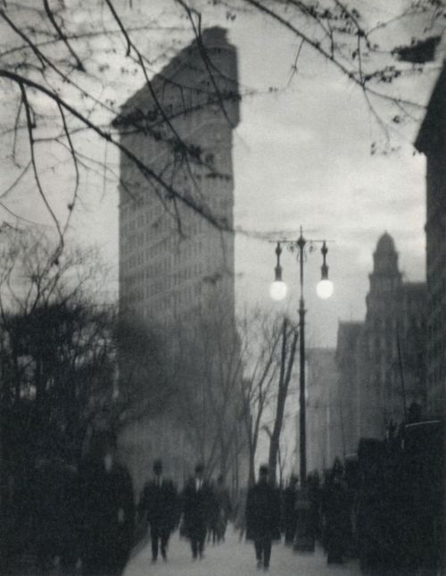
 Edward Steichen, 'The Flatiron, New York', 1905
Steichen's photograph of the Flatiron building is taken from a great distance. So much so that other buildings beside it are visible and the viewer can make size comparisons, understand scale and appreciate the height of the building. Also, the building is centred unlike any of the other images. This could suggest the significance of the building as it was considered an icon of modernisation back in the 1900s after its completion.
Rather than the building itself, Steichen has focussed on the trees stretching across his frame nearer his camera and a couple of passers by in the street. He is concentrating on fleeting moments rather than the constant - the building in the background of his image providing context but it's importance still relevant. The dark tones of the branches and the figures cast against the pale background of the sky and the building creates contrast as well as displaying a large tonal range in the image.
Both Steichen and Stieglitz's images of the building were taken in Madison Square Park which enabled them to show the vertical rise of the building and was a conveniently large place to set up to take the photograph. The depth of field is quite shallow in this image of Steichen's but the effect is also aided by how far away in the background the Flatiron Building is.
 Alfred Stieglitz, 'The Flatiron', 1903, and
Alvin Langdon Coburn, 'The Flatiron Building, 1911
Alfred Stieglitz, 'The Flatiron', 1903, and
Alvin Langdon Coburn, 'The Flatiron Building, 1911
Very similar in terms of photographic components are Alfred Stieglitz's and
Alvin Langdon Coburn's images of the Flatiron. Their images both include
trees and branches as an element of nature and the Flatiron building from a distance as well as a low street-level view and evident figures and signs of human life. They both utilise quite a shallow depth of field to focus mainly on the natural elements in the frame.
Stieglitz's image however doesn't include any obvious figures (there is only one small figure) and it almost seems as if the tree is what is really desired in the photograph and the building just happens to be there. However, the way in which the photograph is composed in two halves is intentional. Stieglitz said the building “appeared to be moving toward [him] like the bow of a monster steamer–a picture of a new America still in the making", and he obviously wanted to capture this feeling and show it's importance in his photograph. There is a shallow depth of field in this image as the tree is in focus but little else is.
Stieglitz took his photograph in evening light after it had snowed which gives it a very picturesque look. The flat tone of the photograph is due to his influence from Japanese wood-block prints. The lighting of Steichen's image and Coburn's image seem similar, maybe taken even later because it looks like there are street lights on and the street and the tone of the figures is quite dark.
These three images have a few small differences but share more similarities in terms of aesthetics. The photographs are complimented with landscape; thy are not architectural views of the building or portrayals of the building stading alone.
Walter Gropius, Walker Evans and Berenice Abbott have also portrayed the Flatiron Building through photography but in a very different way to Steichen, Stieglitz and Coburn.
Walter Gropius, 'The Flatiron Building, New York', 1928
Before Gropius took this photograph of the building, he had just resigned from a design school he both founded and directed and had been doing so for almost a decade. He is primarily an architect and the way in which he has taken his image of the Flatiron Building clearly shows his interest in architecture. The difference of the American architecture compared to where he'd come from surprised him. The concept of his photograph is very different from that of the previous three as he is seeing the building differently; through architects eyes so to speak. He does not portray the building along with other elements like Steichen, Stieglitz and Coburn have chosen to and also unlike the previous three the depth of field is large to include as much detail of the building as possible.
Gropius has taken his photograph from a very low angle with his camera directed upwards to include the height of the building in his frame while taking it at a close distance. This technique exaggerates the height and again, as in Steichen and Coburn's images, we gather a sense of scale by comparing it to other buildings in the photograph. The Flatiron Building here appears to dwarf others in the image which suggests superiority like Steichen has made the Flatiron Building in his image come across in a similar way. The image has been taken at an interesting angle which seems to allow the viewer to appreciate the architectural side and the size and shape of the building as Gropius would have done. Rather than the focus being on anything surrounding the building or any other aspects like nature and people, the focus of the photograph is solely on the architecture which is another difference this image has to the previous three.
Walker Evans, 'Flatiron Building seen from below, New York City', 1928-1929
Walker Evans' image of the Flatiron is very different again. There are no people or trees or elements of nature framed in the photograph; neither does the image seem to show the architectural element of the building because little of it has been shown. Instead, it is framed by other things and the view of the building is front on as none of the previous have been.
It has been taken from a very low angle as Evan's includes in his title: "seen from below". It looks just like a view of the building if you were to stand in front of it on the street and look up to the top. The composition is very geometric; a very different visual strategy used to portray the building compared to the first three images especially. Two other structures meet in straight lines at different angles on the right of the building while the building itself is clearly curved, windows repeat in an ordered way and a street lamp comprised of spheres and a curl protrudes from the left of the Flatiron. The depth of field of the image seems to be small or medium since the foreground structures are in focus but the building behind starts to go out of focus.
Evans has almost made the building seems small and insignificant with his framing and how he as cropped a lot of the building with the other elements.
Berenice Abbott, 'The Flatiron Building', 1938
Like most of the previous images of the building, Abbott's shows the height and size of the building through including the top (and like Steichen's, Coburn's and Gropius'; other buildings to show the scale). Like the previous two images, this has been shot from a low view and the focus is on the building, not anything else. Similar to Gropius' portrayal of the Flatiron Building, Abbott has also used a large depth of field in her image for a great amount of detail.
Abbott's photograph is quite like Evans' in terms of scale and also Gropius' as you can see a relatively large amount of the building. But also like the previous two images, it is more about the architecture and less picturesque than the first three of Steichen's, Stieglitz's and Coburn's. The image was taken in the day time and in natural light which could contribute to the fact that it is less picturesque and more geometric than the first three which were taken later in the day in evening light creating more of an atmosphere.
I have chosen to compare these six images in two halves because I feel the first three hold more similarities to each other and less aspects are different as is the same with the latter three which relate more to each other. I believe the fact the first three photographs of the Flatiron Building were taken much earlier in the 20th century than the last and photography is constantly changing contributes to this.