Pages

Friday 18 May 2012

Fashion Constructed Image: Self Evaluation

How I feel I carried out my roles

My roles within the group were build lead and budget manager. I found it difficult to carry out these roles and feel I would have been much better suited to sourcing props because I enjoy interior design and the creative aspects behind photography. One of the drawbacks of my jobs was that they weren't a constant thing I could work on. 

I made an effort to voice my thoughts about the build when we had test shoots in the lead up to the build week and tried to take an active role in erecting the set when it came to the construction. It was hard to stay on top of the build and direct people when as a group we all got on with it and didn't need a lot of guidance.

When carrying out the role of managing the budget, I produced a spreadsheet involving a list of what we needed with columns for details, cost and who payed for these items; as well as what our total budget was and how much we had spent so far while I was updating it throughout the lead up to the build. We spent a third over our budget which surprised me because I updated the spreadsheet with things I wasn't aware we had bought or even needed for the construction of the set after it was over. I feel there was a big breakdown in communication throughout the weeks we were working on this project. We needed to meet up more often in person to talk about the set build and communicate better with each other as to what moves we were making within the group.

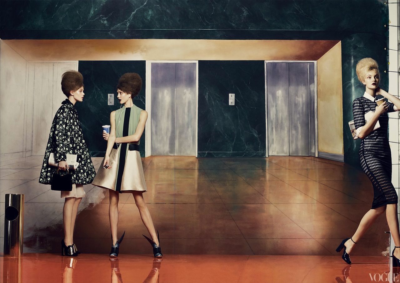
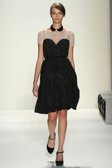
Despite it not being my responsibility within the group, I contributed towards researching and sourcing fashion items. See here.

Fashion Constructed Image: Finding the Fashion


My Contribution

Having been told our constructed fashion image needed to involve contemporary fashion we tried to source clothing from certain retailers in the high street which were based on catwalk styles. We also had some guidance in the form of the following photos to help us find the right outfit for our image.


We can see that the general similarities in these images are long skirts and high necklines and collars. As well as this, there are a lot of neutral tones with some bright reds and blacks but not too much of a variation in colour.

***

While other members in the group were using this as inspiration, I decided to research what the current top trends on the catwalk were and look for clothing on the high street that related to these but which also fit with the classic 50s style; tying in the original with the contemporary to create a generally modern look.

The top few trends of New York Fashion Week (Spring 2012) are bird prints and sheer fabrics of which I found a surprising amount of while out looking. I was also keeping an eye out for the 50s style showing through in modern clothes. Some of the following photos are what I found...


The bird print vests are both very modern styles, however, similar clothes were also found in the 50s - collars, sleeveless, and ties at the hem. They are also made from sheer fabrics. The sheer skirt is knee length as they wore in the 50s. The dress is over the knee and fitted which shows off the woman's figure. This is known as a "wiggle" dress and originated from the 50s. They would also wear short jackets with three quarter length sleeves and I saw a lot of these in the shops I visited, some with round collars.

***

As well as this, while working with my group, I found relevant contemporary dresses mimicking the styles on the catwalk such as:


Wednesday 16 May 2012

Output Task - Planning our Newspaper

As a group, we have decided to take inspiration from the '50s Photo Dictionary'. We admired the mix between handwritten and typed text and the difference in layout between images, but mainly the minimal theme involving lots of white space around the images.

For my input in the newspaper, each of my images will be on the left hand page of a double spread; placed in the centre of the page with lots of white space surrounding it. I will add hand-written captions detailing the prices of what I have photographed because these are important to my concept and will help readers to understand my concept and the meaning behind it.


These are the captions I will hand write for each image:


Large 3 seat leather reclining sofa: £57
Average price new: £1500

Solid wood table: £60
Average price new: £500

Large solid wood chair: £35
Average price new: £100

'BC Rich' electric guitar: £147
Average price new: £600

'Marshall' amp: £30
Average price new: £200


The following articles are what I want to be used to compliment my images in my part of the newspaper, in order, and in conjunction with each image:

Fashion: Constructed Image: Process of Visual References

We began creating mood boards based around the category of "Film" during the first week of having the assignment. These depicted scenes of films we admired the lighting choices of, examples of film noir, some of Tim Walker's fashion sets, strange and interesting rooms, the theme of exploration which particularly interested Joe Earley, photos of collections I found particularly interesting and some elaborate and even gothic make up styles. Generally, aesthetics we desired.


We displayed these mood boards and talked about them as a group. We discussed going for a similar look to the rooms in the last mood boards - we liked the extravagance and the vibrant colours. We also like Tim Walkers fashion influence upon our mood boards and thought we could work with something like this.

However, upon having differing opinions we began to talk about a set split between a modern and colourful look and a more subtle traditional feel. One of the suggestions was creating a room directly split in half, each half showing a very different picture as well as the model being styled very differently on each side of the body. Two things came from this: the idea of duality, and a reference (Dark City) dealing with the notion of two opposites residing together.

Due to this influence, we then narrowed down our ideas and came up with revised mood boards depicting the psychological aspects of films which also exhibited the idea of duality such as Blue Velvet, Donnie Darko and Fight Club. We also started thinking about the American Dream after exploring films like Blue Velvet and American Beauty thinking about the notion of duality within them.


After this we decided to work with the idea behind the American Dream and focus on the facade behind it. How everything seems perfect but behind closed doors it is a very different story. We thought about what would be involved in our set f we went down this route. We decided fairly early on that we would build a dining room, and have a female model who would be the housewife looking after the home. We created more mood boards from this point focussing more on fashion and character and also the period of the 50s and what the home would look like in this decade. The look of the model became important as we decided we wanted a false look; doll like and awkward.


After this we considered the composition of our photograph and what would be included. Originally we wanted a whole family around the table. However we realised this would cause more difficulties due to sourcing the right models and especially because children would be involved as well as possibly crowding the image.


We then considered the use of mannequins to reinforce the awkwardness and doll-like look to contribute to the false perfection behind the concept of the American Dream. From this we ended up researching the aesthetics of the Nuclear Towns designed for experimentation and analysis of the effect of nuclear bombs in which mannequins were used.


These are what we used as our final visual references to achieve the right aesthetics for our concept having developed from all the influences we had from the beginning and honed in on what we felt was strong. We tried to make our set look like a real home, just as the nuclear homes were designed t seem real and why mannequins were placed within. Having been unable to source a mannequin we directed our model to seem fake, like a doll or a mannequin with awkward limbs and a strange posture with a distant gaze.

As well as this, we wanted to involve the outside with the interior and we used these photographs as inspiration and references for creating a similar look in our set with the juxtaposition between this strange occurrence - sand entering the house from the desert with what is seemingly normal and everyday life for the housewife.


Sunday 6 May 2012

The Output: Basic Newspaper Research

The Guardian

Front Page
Across the top of the front page there are medium sized images which have been cropped and accompanied by captions introducing the stories further inside the newspaper. They are like snapshots of the issue and some quite typical, for example, 'Red or dead? United slip puts title in balance. In sport'. There is a quick heading, a small summary, where the story is located in the paper and a football related photograph, all the size of a credit card. Using these photographs in this way catch the attention of certain audiences looking to read about specific topics. Seeing just the cover of the newspaper with these images on may convince them to buy the paper because they know what they can find inside.

Below this strip across the top, there is a thick, black line separating it from the rest of the page where the stories lie. Beneath this is the headline associated with the picture and the column beside it. This is the main current story the newspaper is covering and continues within the paper. The image stretches across 4 out of the 5 columns; a large image for the main story with a caption beneath in a small font.

Below this again is another thinner line separating the two big stories. There is a larger headline, with a subheading and 4 short columns, continued inside the newspaper.

Across the whole front page there is another line separating the top of the paper with the main stories  on and there are two more examples of stories inside; one begins on the cover and continues inside. There is a small picture; a little larger than the size of a postage stamp printed among the columns of this story where there is a bold piece of writing of equal size next to it. The bold font giving emphasis to the importance of this information in conjunction with the story.

***


50 Photos Dictionary (by Fanny Wacklin Nilsson)

"A newsprint publication displaying 35mm film photographs. It is a personal dictionary of a few selected words, of which the photographs are presented in relation to, and my personal relationship to them."
  • This is a 12-page newspaper (including cover and back page with index).
  • There is a mixture of typography: large italic font used for the few headings across the pages; smaller typed font; hand-written pieces.
  • Each page layout is different and seems personal - especially due to the handwritten bits of texts interjected throughout. For instance, there are a few large chunks of writing which describe wither one or a couple of photos on the page, and in contrast, on the cover there is only a single line of text captioning the photo.
  • The photos are all different sizes, and placed in all different places throughout the magazine - some accompanied by text, some not. For example there is a series of three images of a bicycle with nothing written with them (but on the other wise of the spread in the centre), and on the page before that there is a single image aligned to the right of the page and placed halfway down with the paragraph of hand written text beneath it aligned to the left of the bottom of the image.
  • The layout is irregular and the look and style seems to be minimal with a lot of white space.